TYIA BHS
I led an international team to create deliverables for the hand-off phase of the new BHS website design, ensuring smooth and timely transfer to the development team. I facilitated communication, monitored project timelines, and ensured alignment with TYIA’s mission.
Designing Better Products Using Cognitive Design Principles
The Client

Our Mission
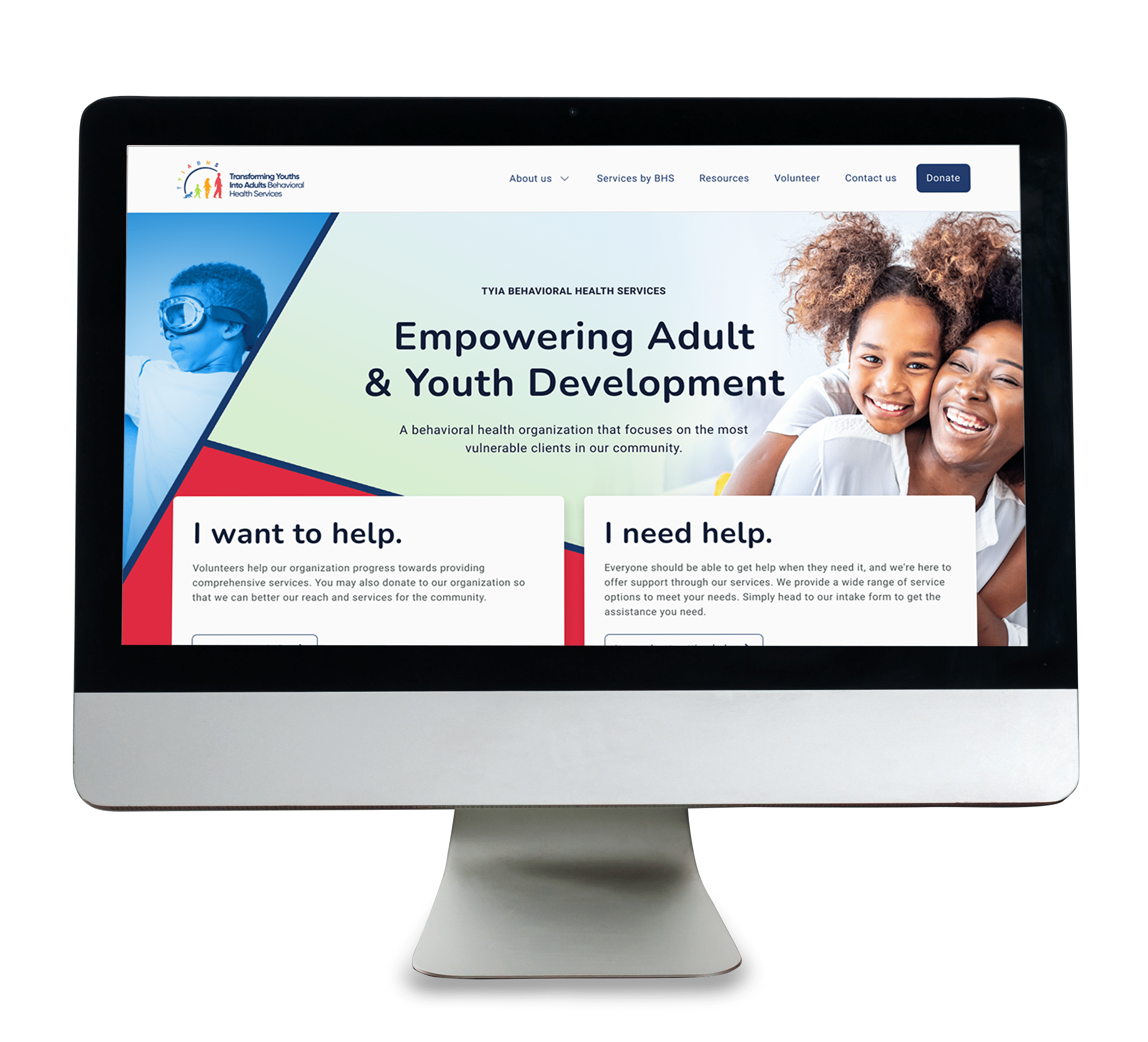
Transforming Youths into Adults (TYIA) is a non-profit organization that offers behavioral health services (BHS). The BHS services were originally listed on the TYIA website, which is targeted towards young adults in foster care, while the BHS services are available to everyone. We were employed by TYIA to create a new, separate, and distinct site for the BHS services that has its own unique look but also relates back to TYIA and their work.
Our Challenges
We were faced the task of designing a new behavioral health services site from the ground up within a tight timeframe and with limited research. The previous site lacked built-in analytics, which left us without qualitative data and insights. Given the sensitivity of the services and clientele—children and adults with intellectual disabilities and mental illnesses—conducting extensive user interviews or surveys wasn’t feasible.
We had to define the requirements and strategize how to implement several features requested by the CEO, including intake forms, event sign-ups, and a gaming therapy page.
Despite these challenges, we leveraged psychological insights, industry best practices, and our unique experiences to create a user-centric website for TYIA.
The Team
My international cross-functional team consisted of Product Managers, Researchers, UX Designers, and Visual Designers, all working together with the TYIA CEO and Developers/Technical Support Team to bring this new website design to life.

Denese Manley Team Lead Project Manager
I led this international team during the hand-off phase by directing what deliverables to produce, facilitating communication with stakeholders, and monitoring project timelines to guarantee a smooth and timely hand-off to the development team while ensuring the product alignment with TYIA’s mission and business objectives.

Akshobhya Sharma Sr. UX Designer
Oversaw the end-to-end process, which included the discovery phase, exploration, ideation, delivery, and hand-off. Acted as the project lead for certain parts of the project, playing a key role in client relationship management and communication. Collaborated with the project developer on delivery documentation and final hand-off.

Joanna Veloria UX/UI Designer
Leveraged best practices, as well as hone the product's information architecture (IA) for optimal functionality and user flow. Also contributed to the visual direction through mood boards, and crafted low to high-fidelity mockups that effectively communicated the interface's layout, features, and user journey.

William Wheeler UX/UI Designer
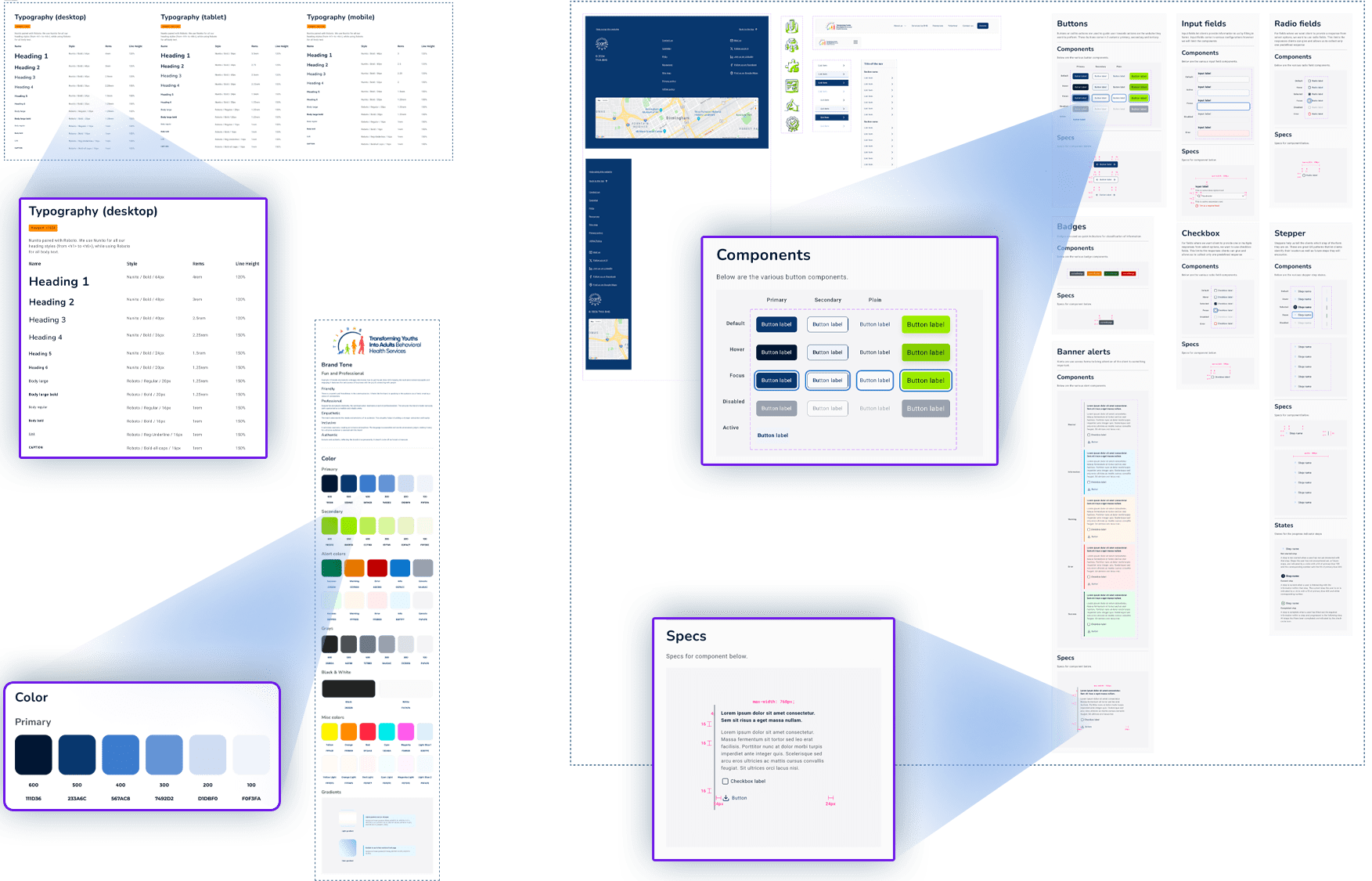
I created the website's visual identity and overall aesthetic. I developed comprehensive branding guidelines and a cohesive color scheme that was applied across all website elements. I assisted in selecting and implementing typography to ensure readability and stylistic coherence. I designed visual elements and played a key role in establishing the design system, which provided a structured framework for future design and development efforts.
Not Pictured (Natasha Lau - Part-time Product Manager and Candice Butts - Part-time Researcher).
Applying Aesthetic Usability Effect
Creating a Positive First Impression
We applied the aesthetic-usability effect by creating a captivating hero image on the homepage to grab the users’ attention immediately. We wanted a design that creates a sense of comfort and trust. The attention to detail in the design elements communicates care and professionalism, contributing to a positive user experience.
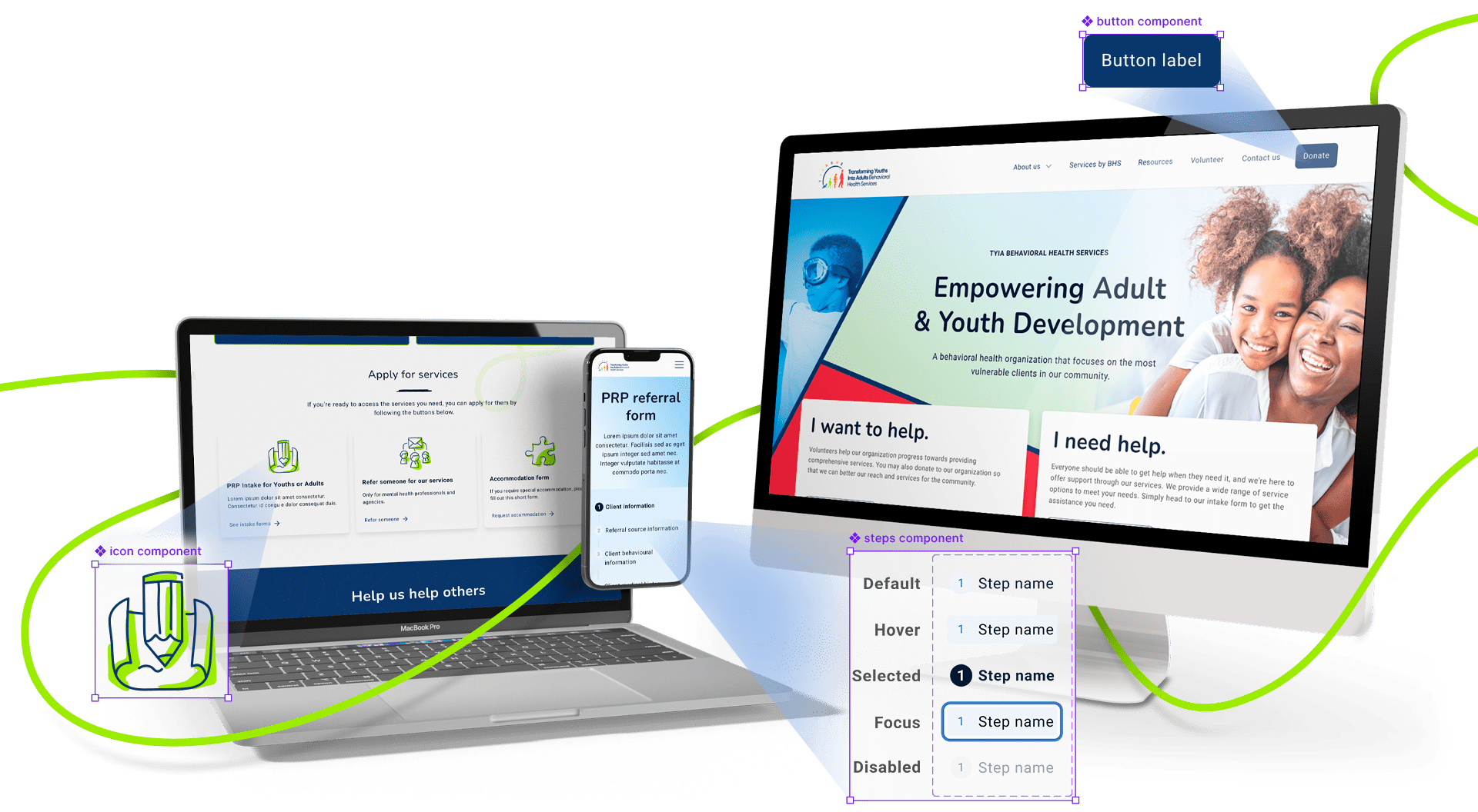
Eliciting an Emotional Response
We designed intuitive navigation and clear calls to action to ensure users can find what they need effortlessly. We also included personalized elements to enhance their emotional connection to the website.
Enhancing the Overall User Experience with Visual Design
We focused on creating an attractive design, that will successfully elicit positive emotional reactions from users. This will lead to more favorable assessments of the website’s usability through visual appeal, emotional engagement, perceived usability, psychological comfort, and user retention. Together, these factors will create an enjoyable and effective user experience, ultimately enhancing the overall perception of the website’s usability.
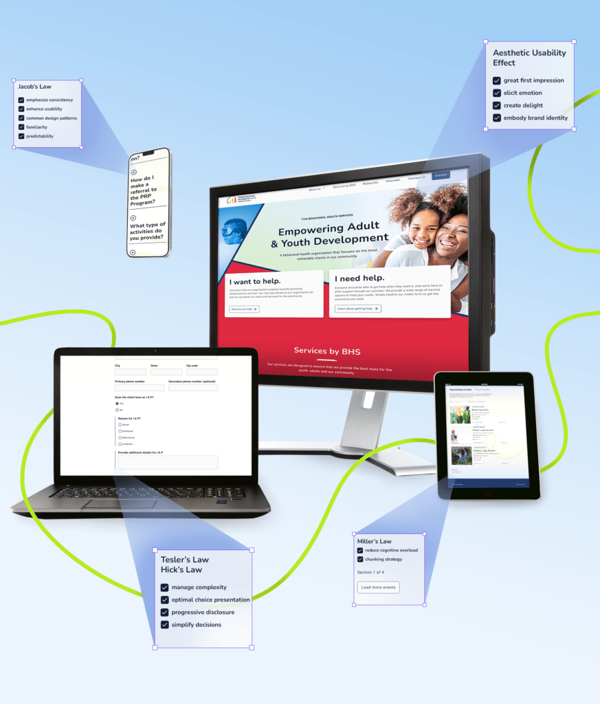
Jakob’s Law
Emphasizing Consistency to Enhance Usability
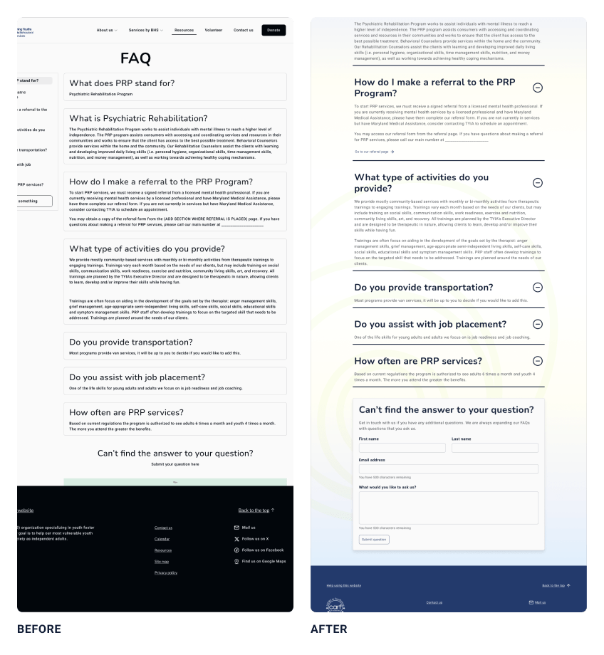
Initially, we explored a sidebar with page anchors. This layout allows users to jump directly to specific questions, eliminating the need for excessive scrolling or memorizing question locations – a big plus for lengthy FAQ sections.
However, we realized this approach was better suited for a larger number of questions. Considering the size and detail level of our FAQ, the sidebar ended up taking up valuable screen space, especially on smaller devices.
Therefore, we opted for a more familiar design pattern – the accordion-style FAQ. This choice leverages user intuition and minimizes the need for additional exploration or learning.
Tesler’s Law and Hick’s Law
Managing Complexity with Optimal Choice Presentation
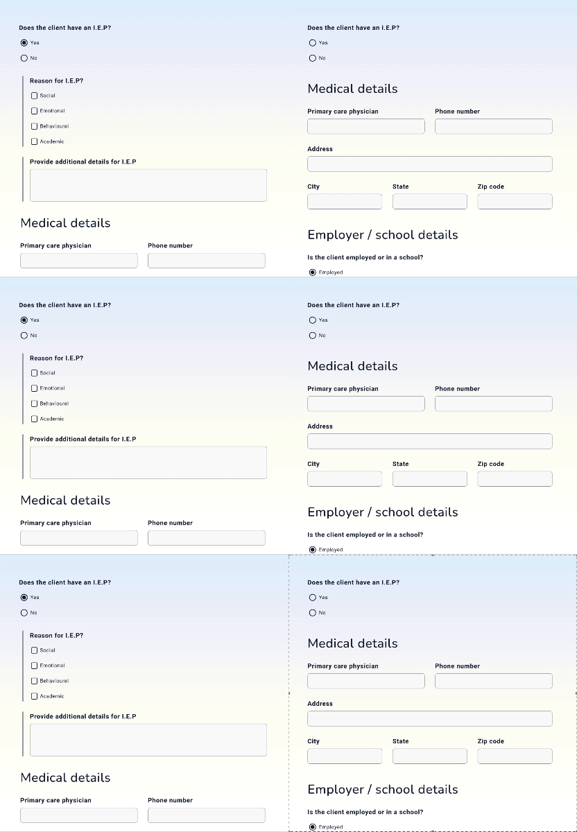
Online medical forms are notorious for their high cognitive load. They bombard users with complex medical terminology and specific details about conditions and medications. This can lead to errors, frustration, and wasted time for both patients and healthcare providers.
We applied Tesler’s Law and Hick’s Law to significantly improve the experience. These principles focus on reducing user burden by pre-filling forms, offering suggestions, and minimizing choice overload.
Finally, progressive disclosure builds on this by revealing information step-by-step, allowing users to focus on the current question and freeing up mental space for thoughtful answers. By combining these strategies, online medical forms become less daunting and more user-friendly, leading to a smoother experience for everyone involved.
Miller’s Law
Reducing Cognitive Overload With Chunking Strategy
When designing user interfaces, it’s beneficial to limit the number of options or pieces of information presented at once to avoid overwhelming users.
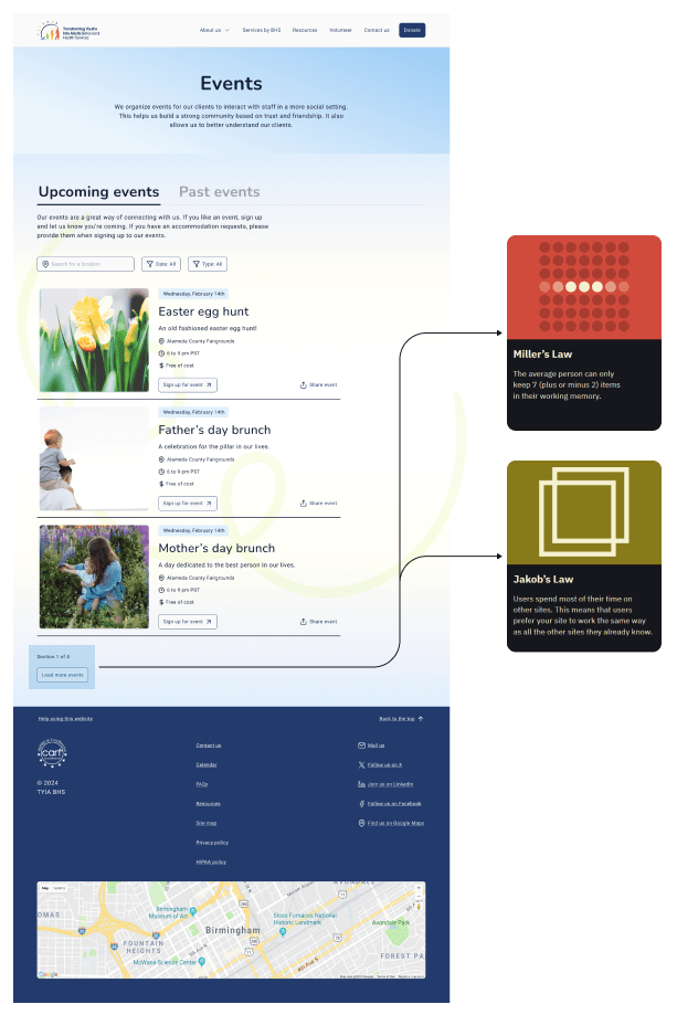
On the events page, we considered the use case where the client has multiple events lined up. In this case, a client might see a lot of event cards which could potentially overwhelm our users.
We researched best implementations for pagination and progressive loading of information, taking a leaf out of commonly used applications such as Instagram and Amazon.
In our solution, we invoked Miller’s law as well as Jakob’s law to allow our users time to digest information about our latest events before loading more events for their consideration.
Final Results
Cognitive Design Principles in Action
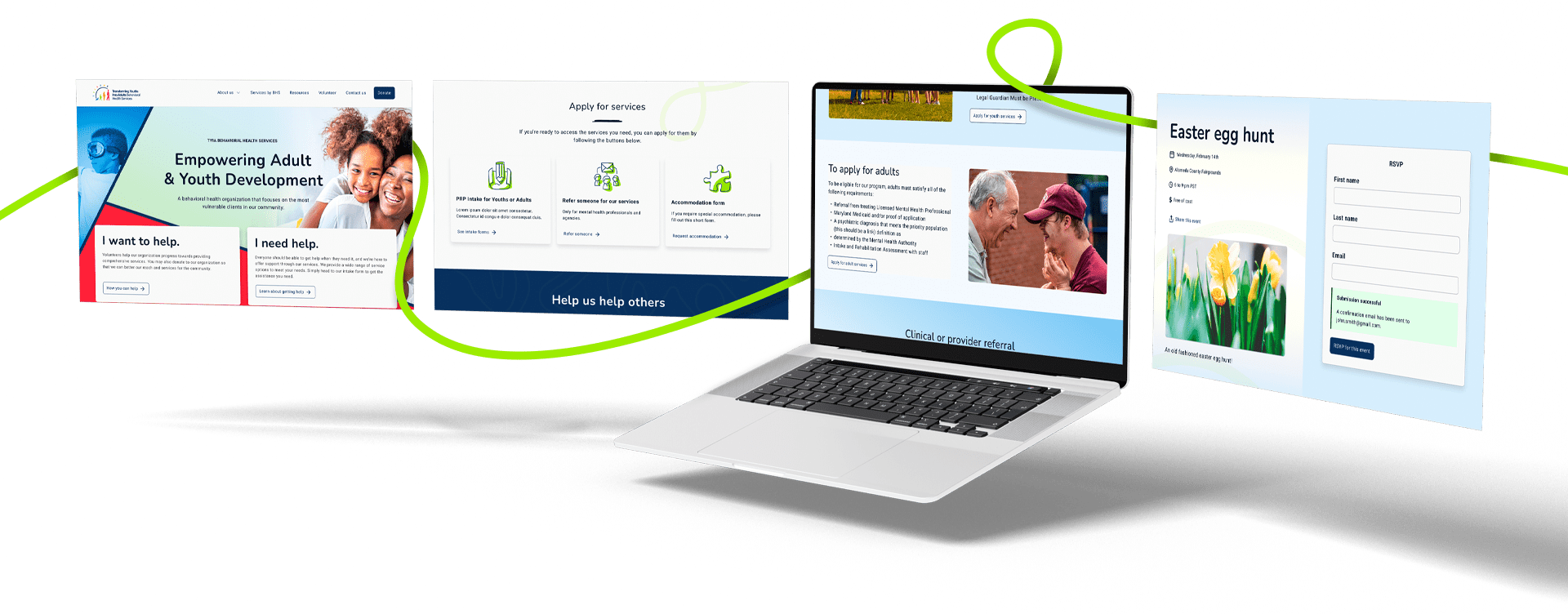
We applied various psychological principles to create a user-centric and efficient design by considering the cognitive limitations and behaviors of users.
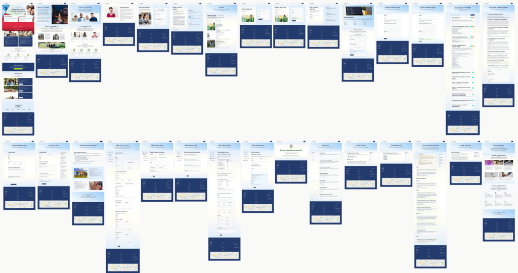
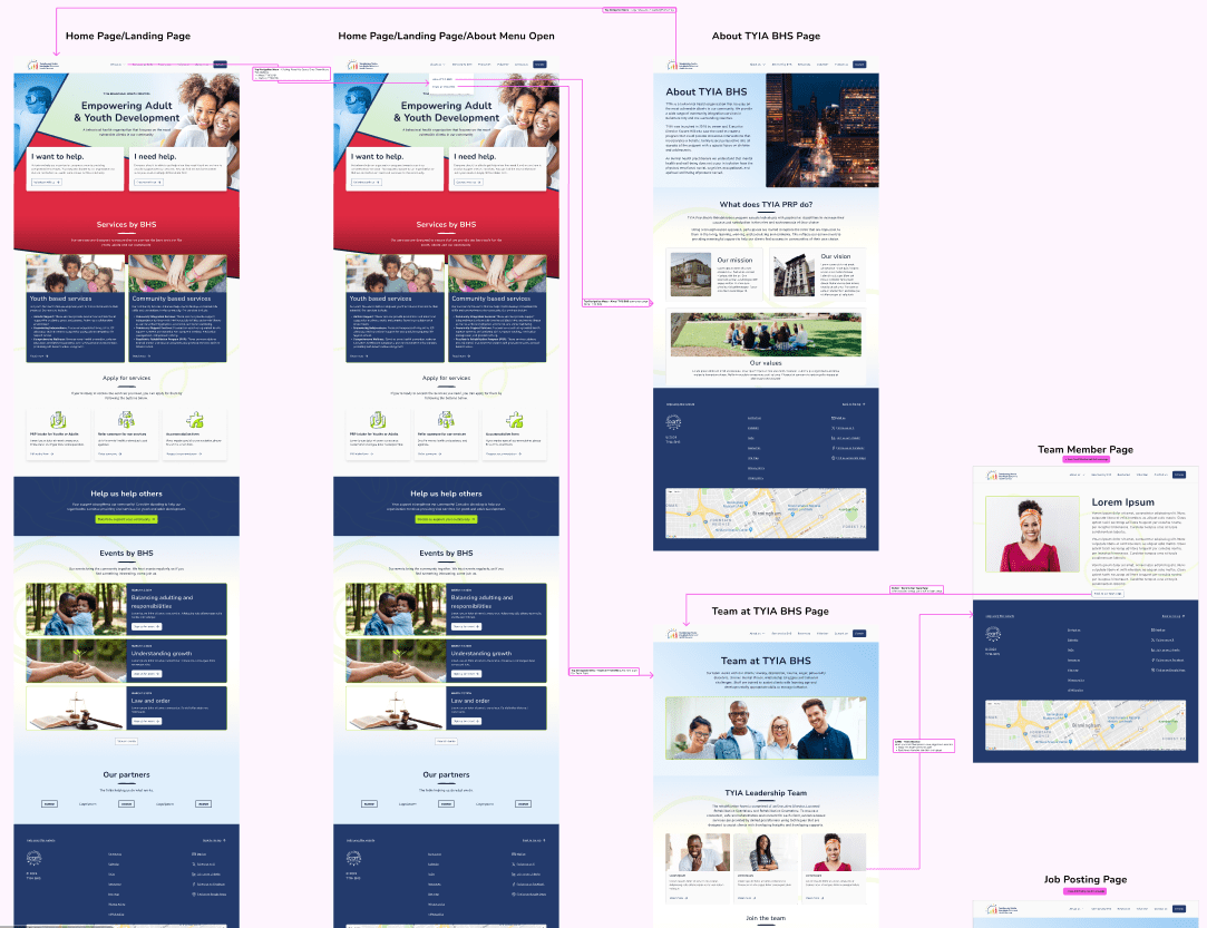
The end result was a 28-page website design.
Development Hand-Off
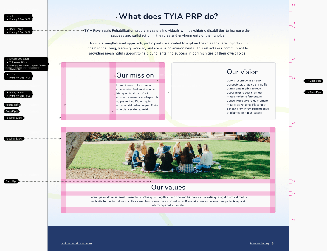
Once the final designs were approved by the stakeholders we then prepared extensively for development hand-off with thorough specifications, user flows, prototypes, accessibility guidelines, responsive guidelines, compliance requirement callouts for HIPAA, detailed documentation, exported asset library and a full design system.
Whats Next
Once the TYIA BHS site is live, we will monitor user experience through analytics and feedback, making necessary design iterations to improve it.
Final Thoughts
In conclusion, despite the challenges of limited research and a tight timeline, our application of cognitive design principles enabled us to create an effective and user-centric design.
By leveraging established psychological insights, we were able to compensate for the lack of extensive user data and deliver a solution that meets user needs and enhances their experience.
This project underscores the importance of understanding human cognition and behavior in design, allowing us to make informed decisions and prioritize usability even under constraints.
Moving forward, continued adherence to these principles will be crucial in ensuring the ongoing success and improvement of our design solutions.

Still want to see more? Check out research, ideation, and other deliverables from this project.
See Other UI/UX projects
Want to work together?
I'm currently available for freelance work.
Explore my services page for more info and contact me today for 15 min free consultation to begin discussing your project.

A multidisciplinary designer with two decades of product design experience, ready to assist you in creating meaningful connections with your customers.
Contact
Connect
© copyright Denese Vicky Manley 2025
Site Designed and Developed by Denese
