CraftShip
I assumed the dual role of UX Researcher and Designer, for a personal endeavor, crafting innovative design solutions that not only addressed user pain points but also aligned seamlessly with common overarching business objectives.

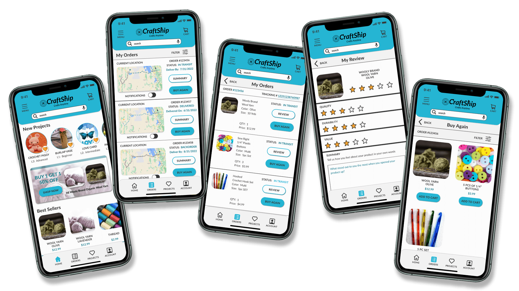
what was the Initiative?
The initiative aims to identify user pain points and determine essential features to enhance customer retention and satisfaction, all while aligning with fundamental business goals such as CLV (Customer Lifetime Value) for this mobile iOS E-commerce App.
Identifying Pain points
Qualitative Research
User Interviews
Key insights identified during the user interviews.

"A missing shipment or an unknown delay can throw off my whole product launch"

"I honestly don't have time to be looking all over for where my shipment is"

"I get so busy with my family, that sometimes I forget I ordered supplies"
"I have a hard time knowing when my package is ready to pick up at the post office"
Quantitative Research
Competitive Audit
Analysis of functionalities available within competitor apps.
Real-Time Location Tracking
Push Notification for Delivery
Comprehensive Order History
Creative Problem-Solving
Users Need More Visibility on their orders
I began determining essential features for problem resolution.
- Orders Dashboard
A central location in the app to find everything they need related to their orders including:
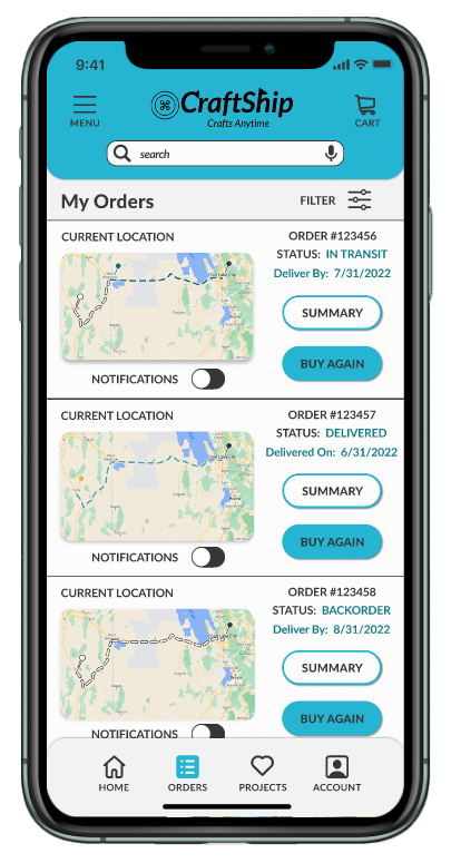
- Real-time Tracking: Enable users to track their orders in real-time, providing updates on the current status and location of their package.
- Notifications: Implement push notifications to alert users about important updates regarding their orders, such as when an order has been shipped, out for delivery, or delivered.
- Implemented cross-sells and upsells at the bottom to boost AOV (Average Order Value).
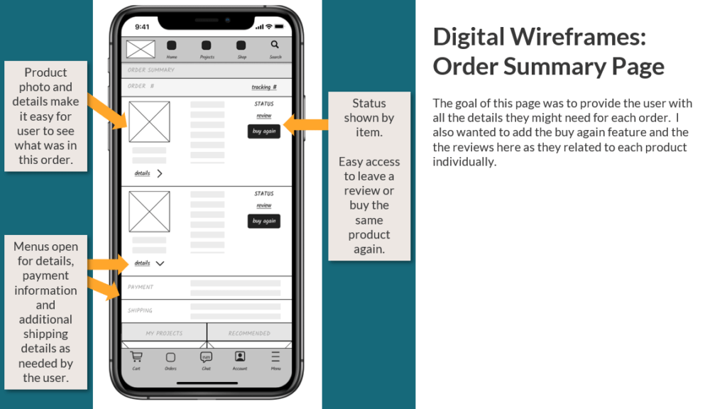
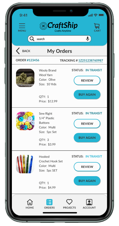
- Orders Summary
Comprehensive Order Summary that includes:
- Details of past orders, including order status, tracking information, and purchase history, allowing for easy reference and reordering.
- Implemented cross-sells and upsells at the bottom to boost AOV (Average Order Value).
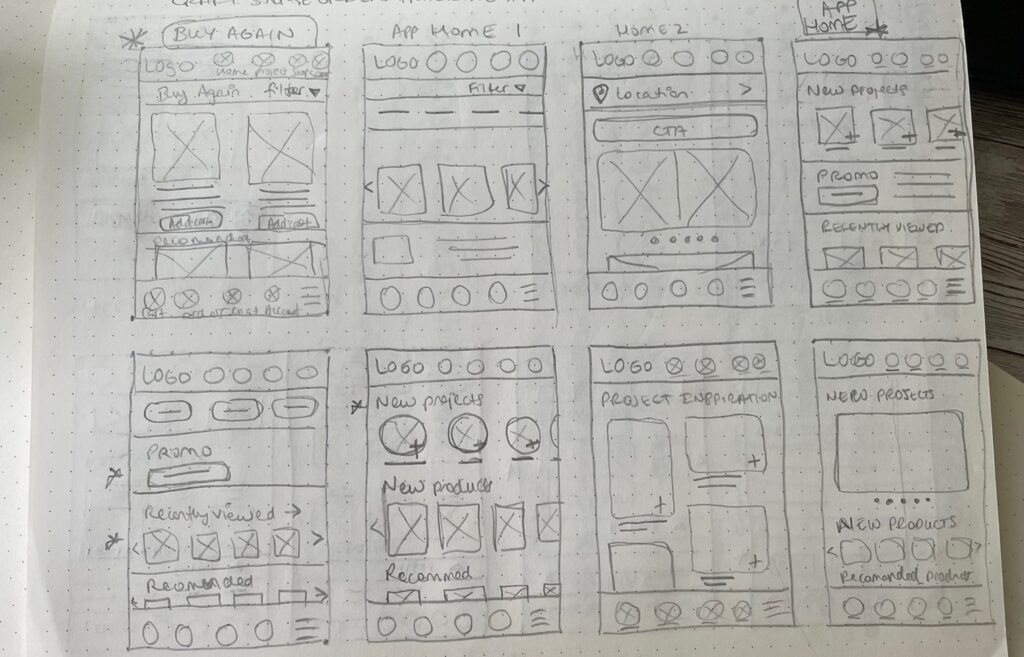
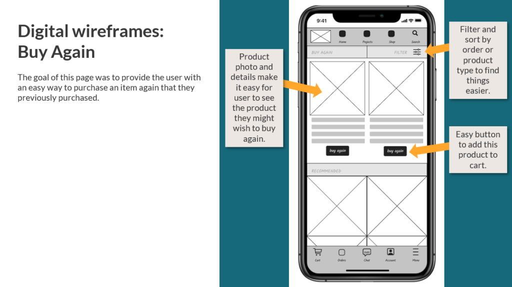
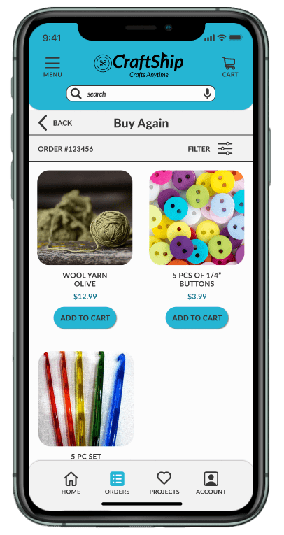
- Buy Again
Adding the option to buy again for the whole order and also specific items from the order summary.
- Creating a personalized buying experience based on what the customer already liked and purchased.
- Increasing the CLV (Customer Lifetime Value) by encouraging purchases with ease.
- Implemented cross-sells and upsells at the bottom to boost AOV (Average Order Value).
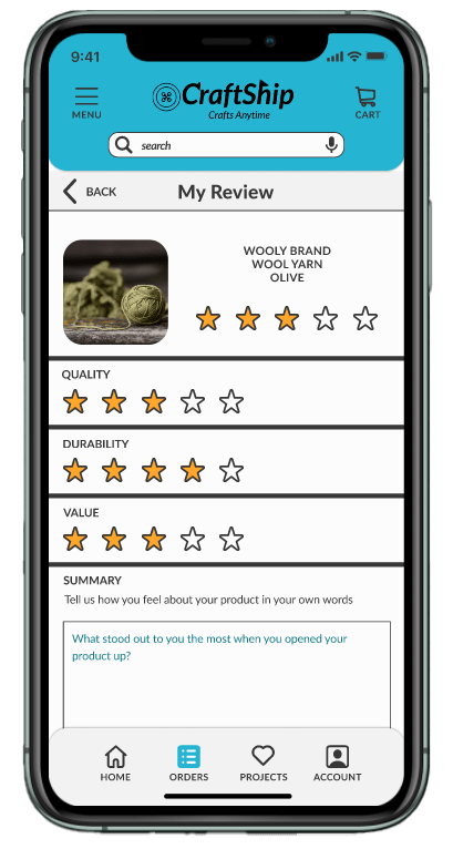
- Reviews
Adding the option to review the item from your Order Summary.
- Crafting a tailored experience that empowers customers to easily share with others.
- Boosting the AOV (Average Order Value) by leveraging social proof to encourage new customers to purchase products they may not have considered otherwise.
Conceptualizing Ideas
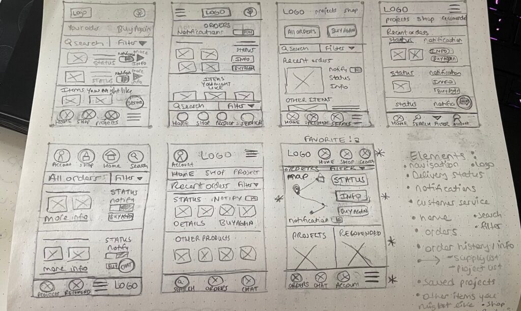
Utilizing Lo-Fi Paper Wireframes to swiftly generate multiple concepts for discussion, analyzing their potential problem-solving capabilities to determine the most suitable option. Subsequently, transitioning to Figma to develop Low-Fi Digital Wireframes, primed for rapid prototyping.
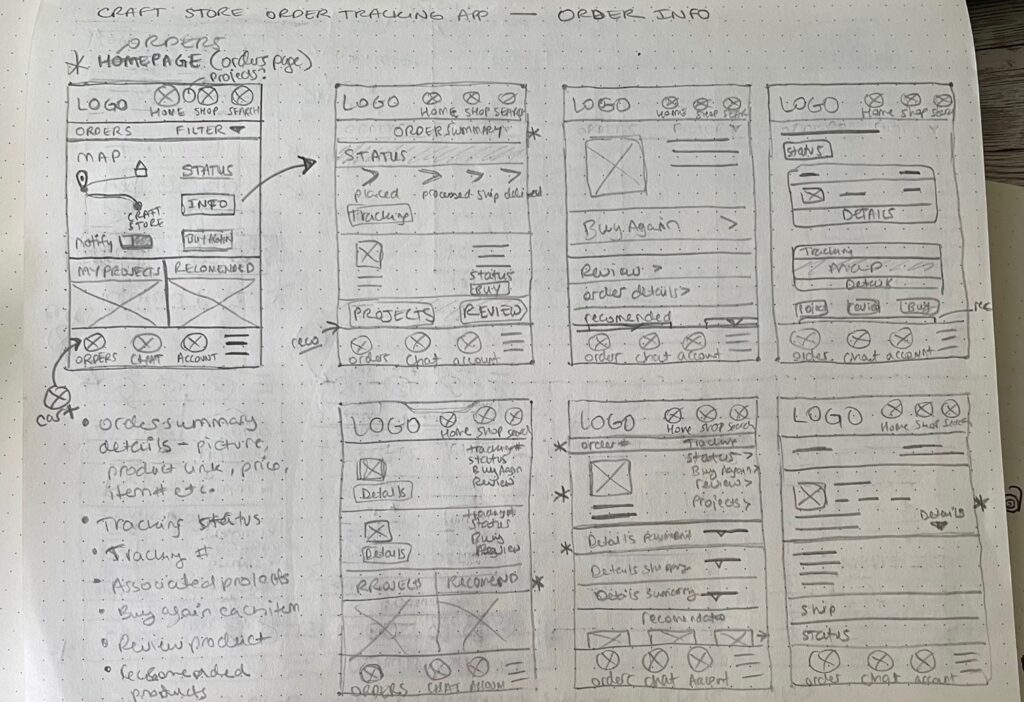
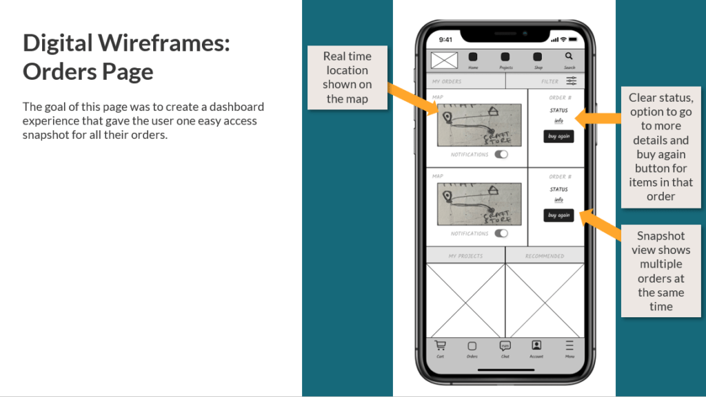
Orders Screen
Offering a dashboard-like experience that provides users with easy access to snapshots of all key request.
Paper Wireframes
Digital Wireframes
Orders Summary Screen
Comprehensive summary with more detail about each order broken down.
Paper Wireframes
Digital Wireframes
Buy Again Screen
Cultivating personalized experiences to enhance customer retention and elevate CLV.
Paper Wireframes
Digital Wireframes
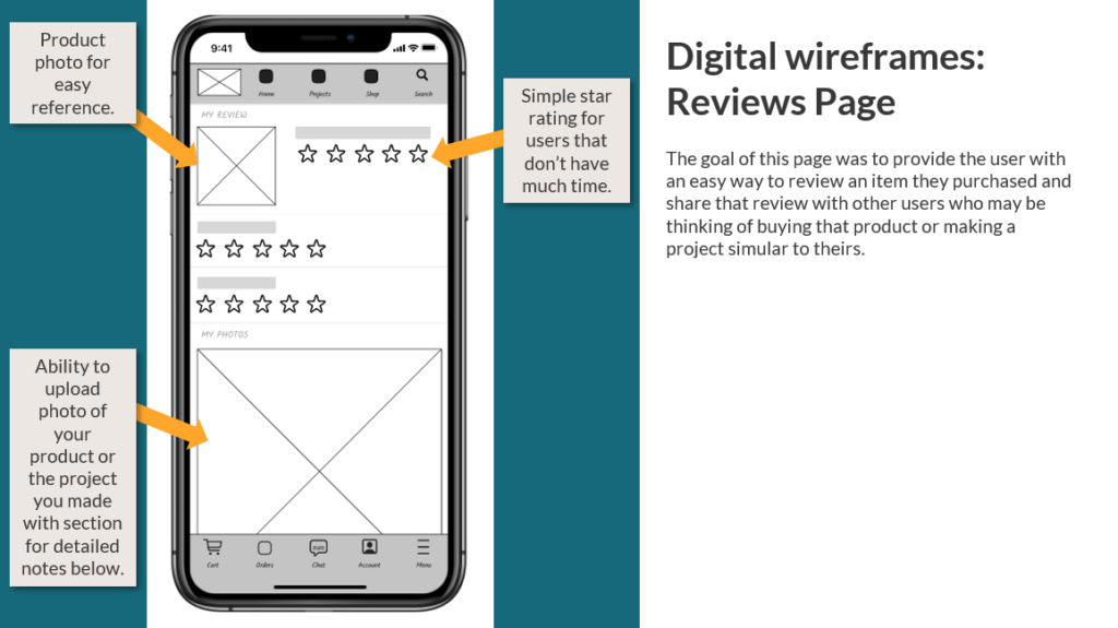
Reviews Screen
Crafting a tailored experience that empowers customers to easily share with others while also boosting the AOV.
Paper Wireframes
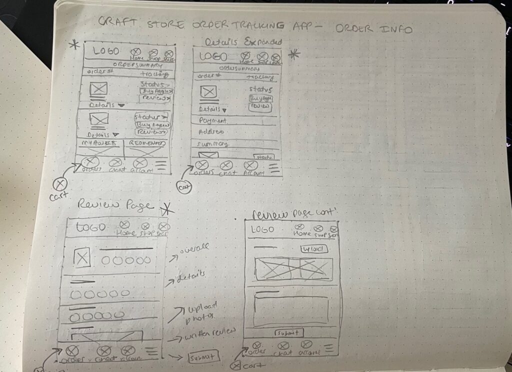
Digital Wireframes
Rapid Prototyping
Synthesizing Results
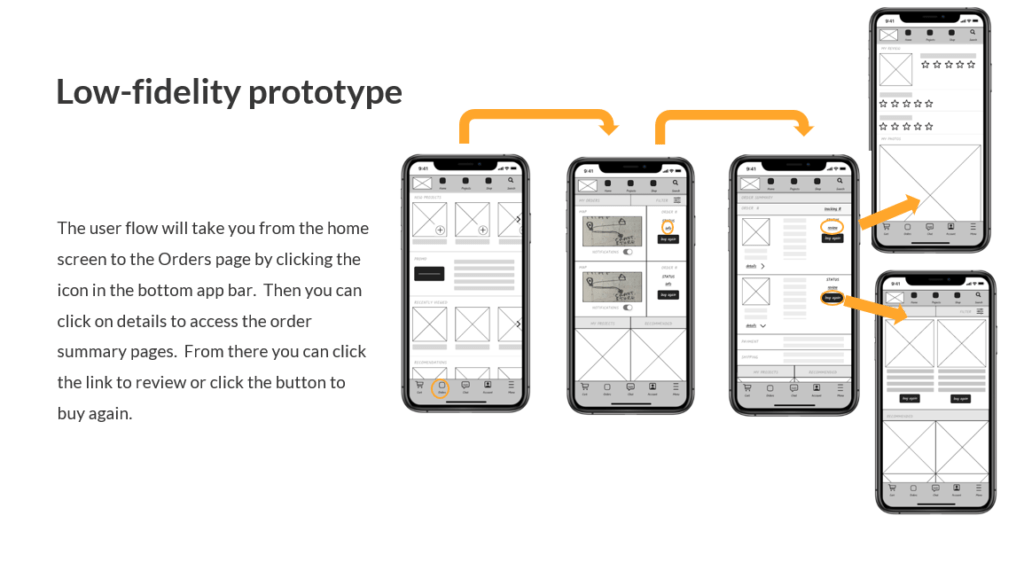
Low-Fidelity Prototype
Moderated Study with five Participants
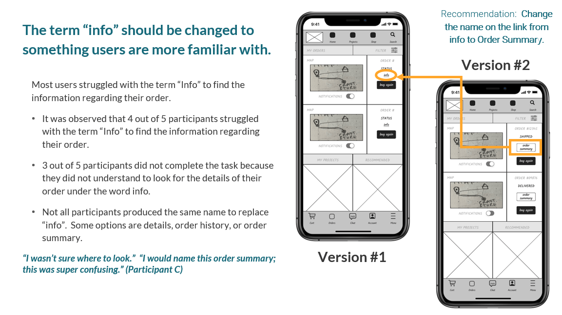
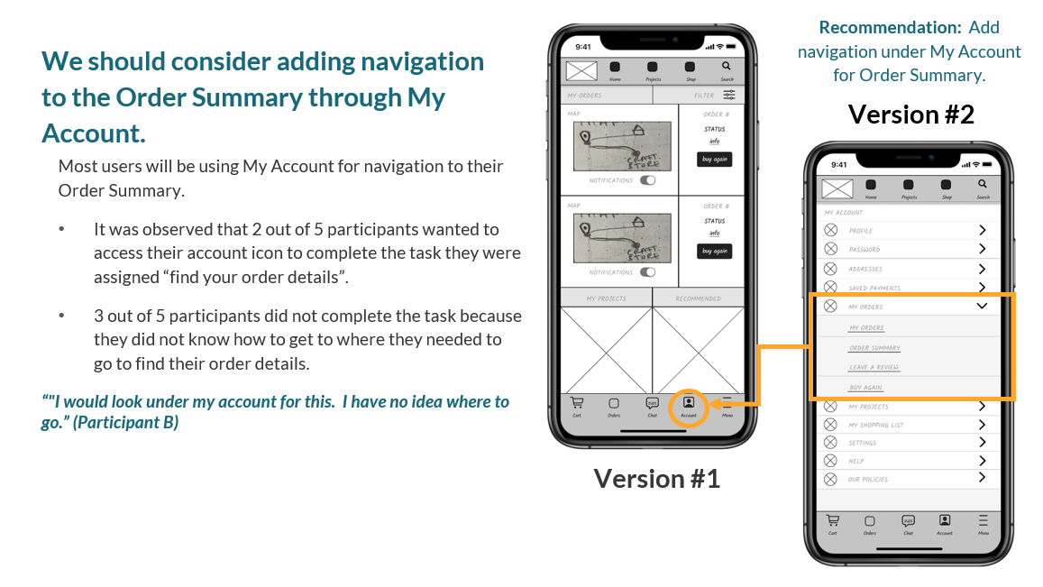
Insights
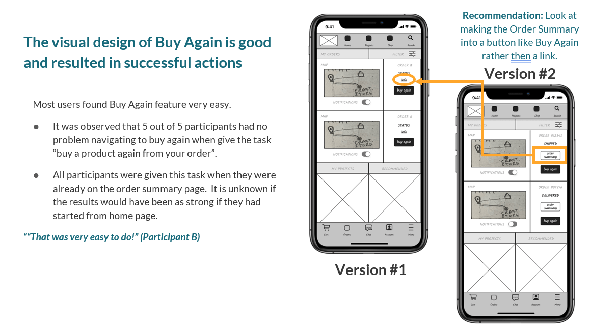
- Rename link to Order History.
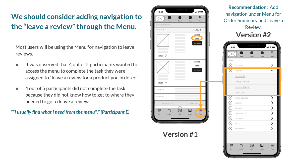
- Add Order Summary navigation under My Account.
- Include Order Summary and Leave a Review in Menu navigation.
- Consider converting Order History into a button like Buy Again.
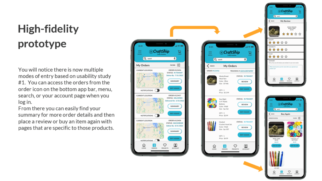
High-Fidelity Prototype
Un-moderated Study with five Participants
Insights
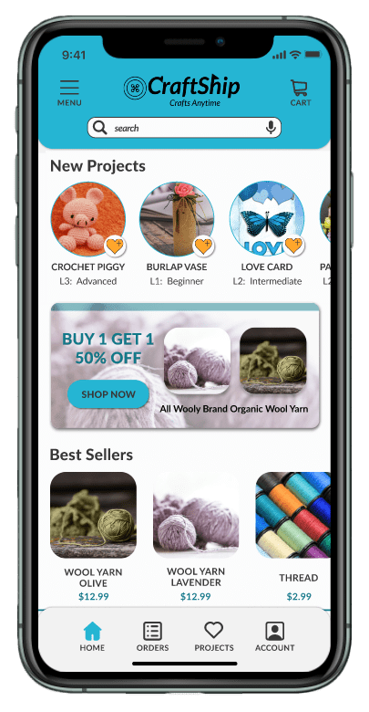
- Increase size of touch target on menu items.
- Modify Buy Again section to display products from specific orders first.
Design Iterations
Digital Wireframes were adjusted based on usability study insights, then reviewed before creating high-fidelity mockups. These mockups were incorporated into the high-fidelity prototype for the second round of testing.
What's Next For Craftship
I am eager to revisit the Craftship app design in the future to enhance the UI further. I recognize opportunities for refinement, particularly in the color schemes, white space and visual heirachy, which I aim to address.
Final Thoughts
I enjoyed employing my entrepreneurial mindset to tackle this project with a focus on incorporating common business objectives. Additionally, it was very fulfilling to harness my creativity to craft iterative design solutions, effectively addressing user needs while strategically aligning with business goals.
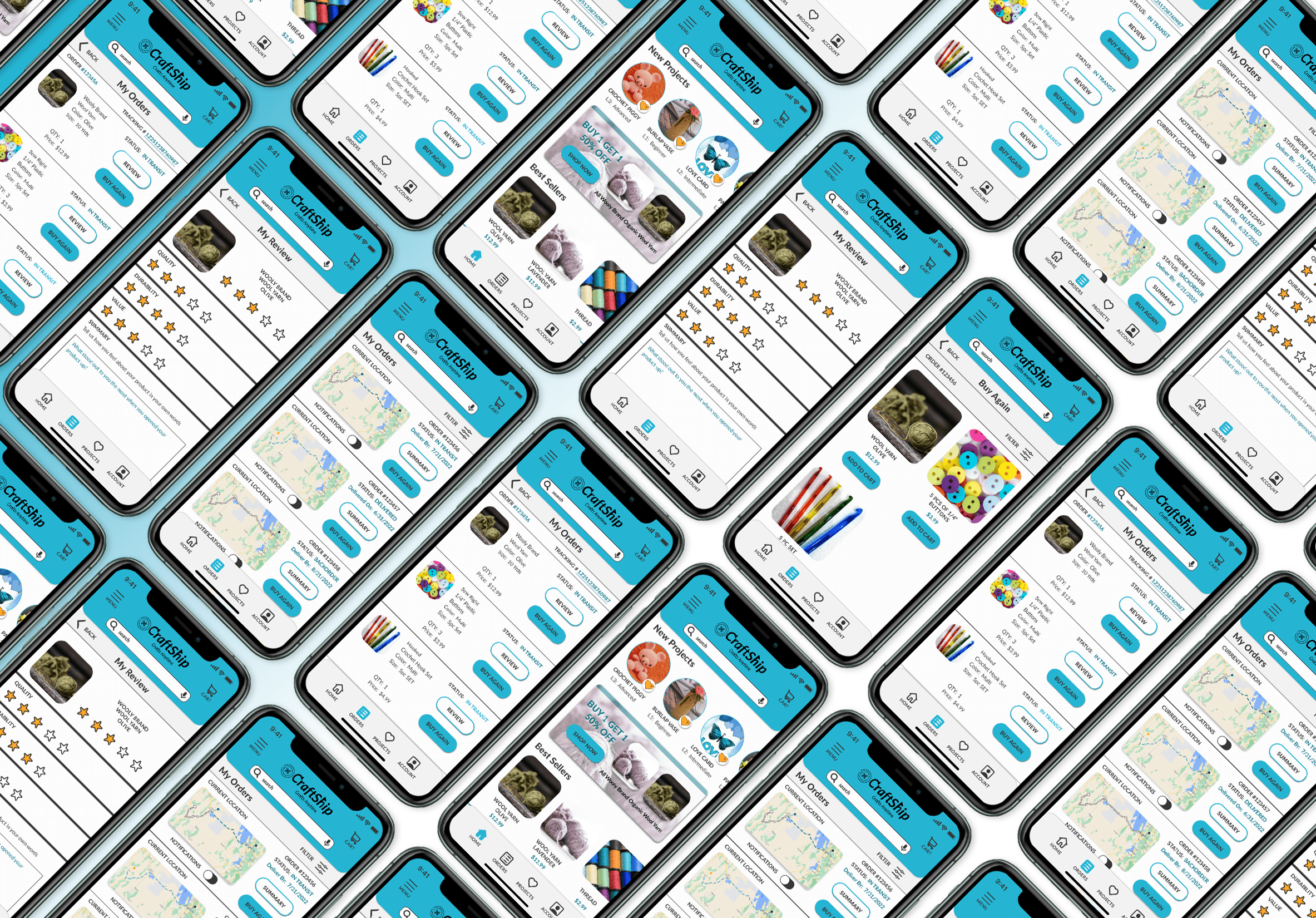
Still want to see more? Check out research, ideation, and other deliverables from this project.
See Other UI/UX projects
Want to work together?
I'm currently available for freelance work.
Explore my services page for more info and contact me today for 15 min free consultation to begin discussing your project.

A multidisciplinary designer with two decades of product design experience, ready to assist you in creating meaningful connections with your customers.
Contact
Connect
© copyright Denese Vicky Manley 2025
Site Designed and Developed by Denese
