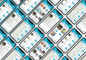
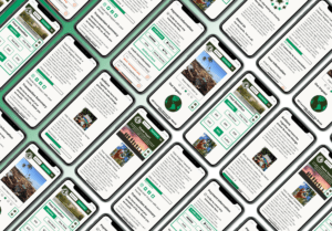
BeeKind
This is an international group project where I worked as both PM and Design Lead, demonstrating how teamwork and design iteration enhances usability testing, achieving a remarkable 96.8% success rate and reducing task failure by 86.67%.
What is BeeKind?
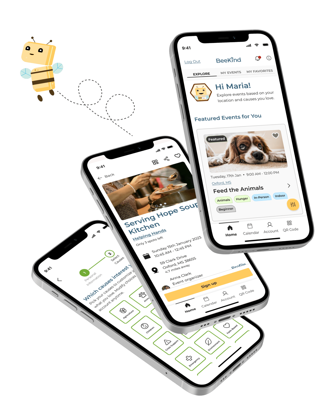
An iOS mobile app that brings together volunteers and community service managers from non-profits through a user-centric platform, BeeKind seeks to establish a cohesive volunteering community. The app aims to inspire greater participation in the workforce by centralizing opportunities, attracting prospective volunteers, and ensuring a seamless and enhanced volunteering experience, encouraging volunteers to return.
Empathetic Discovery
Market Research
I Identified a Challenge.
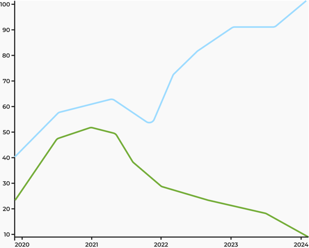
According to the U.S. Bureau of Labor Statistics the growth rate of employment for social and community service managers is expected to be faster than average over the next year. These are the people who coordinate and supervise programs and organizations that support public well-being. They direct the workers and volunteers who provide services to the public. However volunteer labor is still on the decline, with 2024 predicted to be another “make or break” year for the nonprofit sector.
Market Analysis
Why Solve It?
There is a significant need for non-profit community service managers to effectively connect with, attract, and retain volunteer talent. Currently, most non-profits list volunteering opportunities on their websites or social media platforms. However, for a volunteer to discover these opportunities, they must be aware of the specific non-profit organization and actively seek out their offerings. Many volunteers primarily rely on word of mouth to identify opportunities in their area. Our research identified a major deterrent in the transition from a prospective volunteer to an active one: the lack of awareness about where to find these opportunities.
Meet The Team
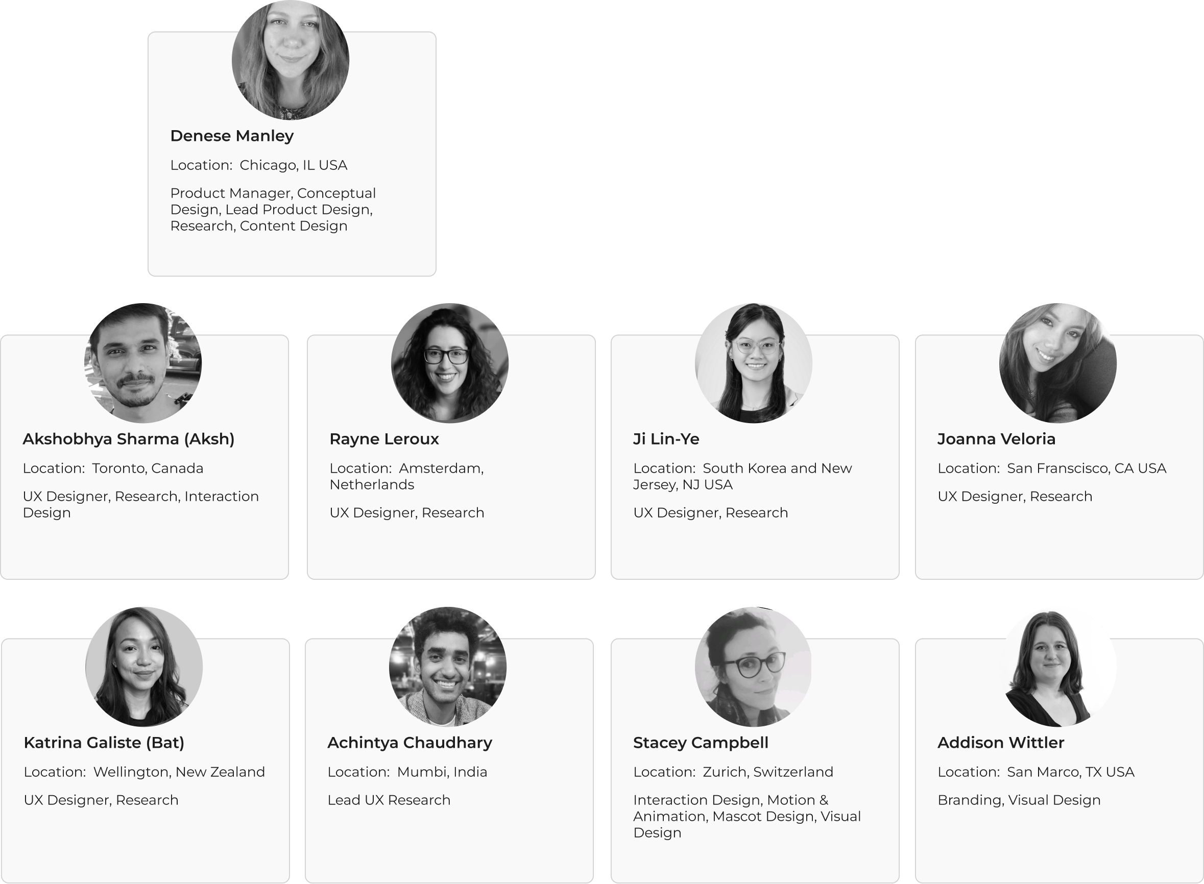
I Recruited an International Team to Help.
Defining the Problem
Research for deeper user insight.
Competitive Audit
Who Else is Solving It?
Several key competitors have created analogous applications to address the market demand. I led the team in conducting a comprehensive competitive audits to ascertain the features embedded in their respective offerings. Furthermore, each team member conducted a SWOT analysis for a competitor, aiming to identify opportunities to enhance and innovate upon existing market offerings.
Product Features
How Are They Solving it?
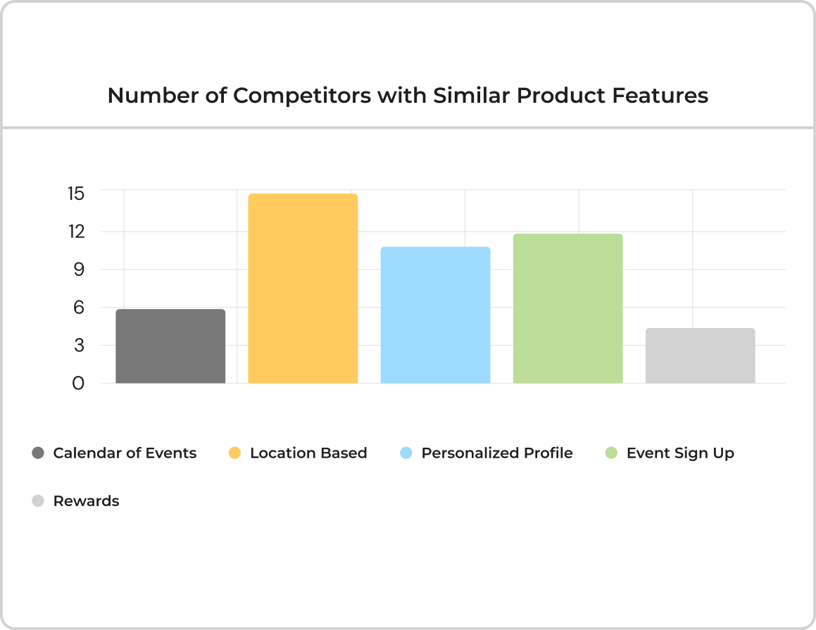
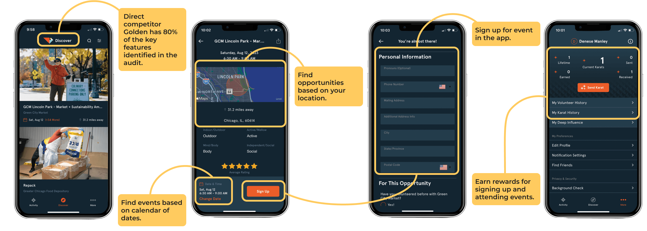
In my examination and analysis of the competitive audit, I observed that a majority of these features were consistently present across various competing applications. Additionally, user feedback, as reflected in comments and reviews on these applications, indicated a strong appeal towards these features. The identified product features include location-based services, personalized experiences facilitated by individualized profile setups, an efficient event sign-up process, a comprehensive calendar of events, and incentive structures rewarding user participation.
Additional Opportunities
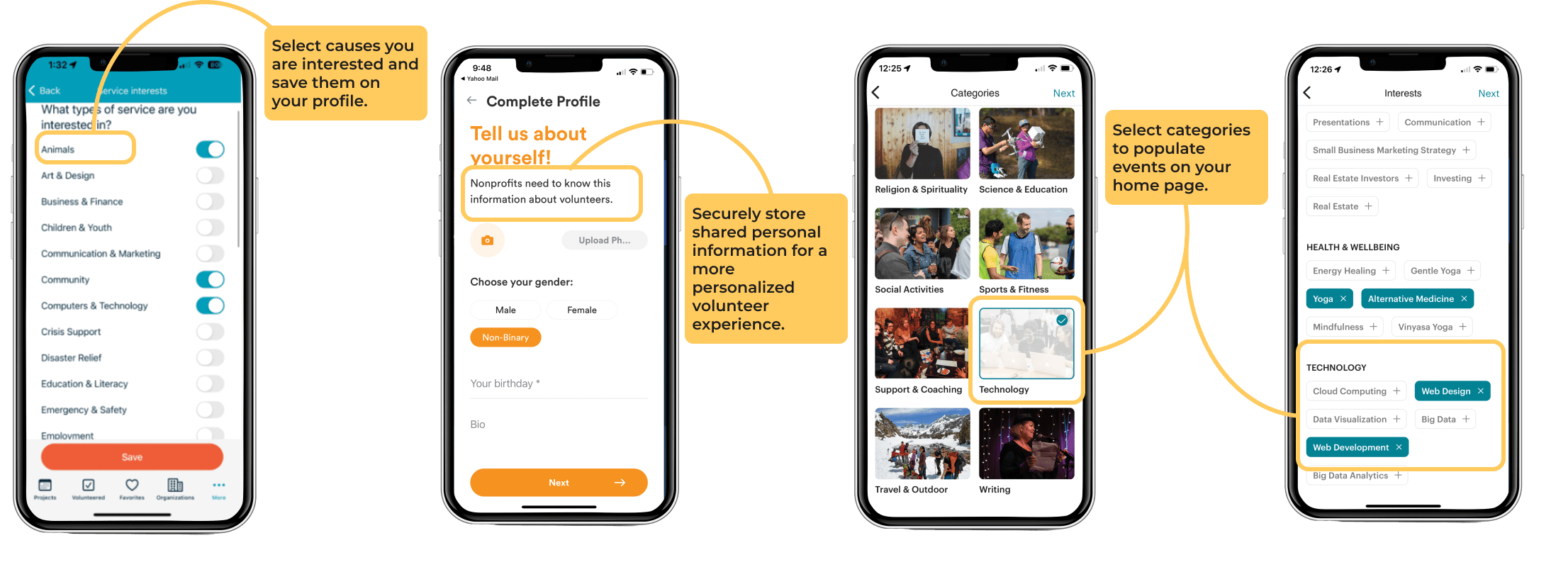
Based on the 80% match of key features, I identified Golden as the primary direct competitor. Upon analyzing other competitors, it became evident that there is significant room for improvement in their user experience. This improvement can be achieved by providing customers with the capability to personalize their profiles and create individualized feeds on their homepage, featuring events and causes aligned with their identified interests.
User Surveys
In conjunction with the competitive audit, I wanted to identify user pain points and explore opportunities for enhancing the volunteer engagement of both new and existing users. This objective was pursued through the administration of a survey, from which data was collected and analyzed from over 100 participants.
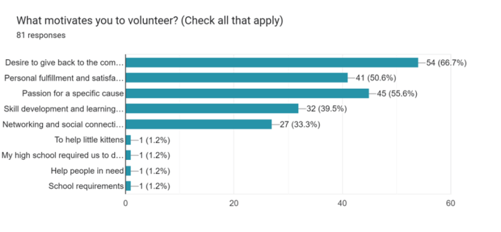
Motivations of people who volunteer
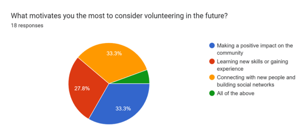
Motivations of people who don’t volunteer
Insights
The survey results highlighted key insights guiding our app development focus. Addressing these points will enhance user experience, boost engagement, and increase user return rates in volunteer events:
-
Insufficient Information: Provide comprehensive event details, organization, and organizer information to address user concerns about insufficient opportunities data.
-
Communication Enhancement: Overcome communication barriers through a centralized app, ensuring clear and concise communication about available events in proximity.
-
Attendance Optimization: Prevent drop-offs by clearly defining roles and specifying skill requirements upfront, thus enhancing clarity and reducing role mismatches.
-
Meaningful Experience: Prioritize suggested events that align well with user preferences to ensure a meaningful experience, ultimately fostering higher return rates.
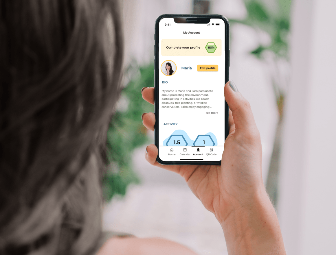
Generating Concepts
Using Mid-Fi Wireframes for our first iteration of the MVP
Each UX designer was tasked with designing wireframes for a specific feature. A total of 49 screens were created to encompass five distinct user flows for testing, corresponding to the five user stories I formulated from the insights obtained during the research phase.
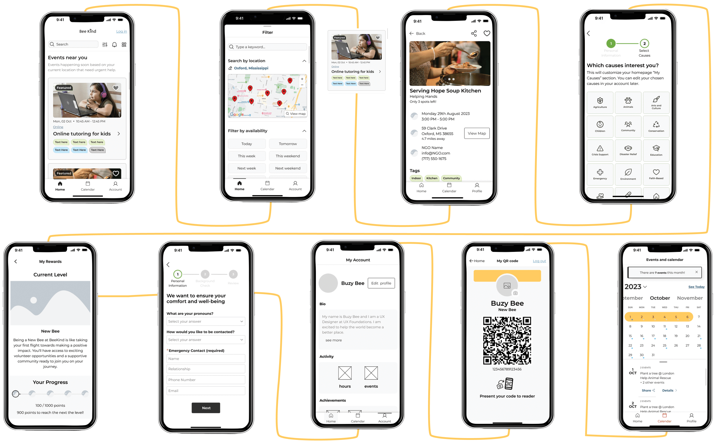
The next iteration involved creating high-fidelity mockups.
72 screens were generated, adhering to the standards established by the UI design system and adding in content that I created. Users were provided with the choice to browse without creating an account or to initiate the account creation process first. Consequently, two distinct paths were created, each featuring slightly different screens.

Rapid Prototyping
Mid-Fidelity Prototype
The prototype utilized in the initial usability study was segmented into five distinct flows to individually test each aspect, preventing user deterrence. Furthermore, A/B testing was conducted on the calendar design to identify the most user-friendly format for date selection.
Click Here to go to the mid-fi prototype
Or view this quick video
High-Fidelity Prototype
The prototype employed in the second usability study is an all-in-one interactive prototype that enables users to explore additional options and pages. I decided to use a reevaluation of the same user task flows from the initial study to assess the improvement in customer success rates.
Click Here to go to the high-fi prototype
Or view this quick video
Test, Iterate, Test Again
The team and I all pitched in to conducted two moderated usability studies using success rates and a SUS survey as our KPIs and think-aloud protocols to better understand users’ thinking. The initial moderated study involved assessing a mid-fidelity prototype to ascertain the efficacy of the designed flows in meeting user expectations, evaluating the coherence of navigation, and ensuring the intuitiveness of feature accessibility for all users. Upon completion of this study, we analyzed the findings, generated an Impact Effort Matrix, and I subsequently reviewed the results with the team. I then tasked all the UX designers with refining their designs based on the study outcomes, and met with them to refine the screens for the high fidelity prototype.
The second moderated usability study was conducted on the high-fidelity prototype to gauge the impact of the implemented changes on the users’ ability to access features, as well as to assess overall ease of use and satisfaction with the application. The detailed results of the implemented improvements are outlined below.
Usability Test Analysis
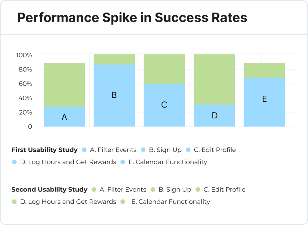
The combined enhancements sparked a notable increase in the average success rate from 63% in the first study to 96% in the second study, this includes success with difficulty. The complete success rate, with no difficulty, went from 37% in the first study to 75% in the second study. We also decreased the average failure rating from 30% in the first study to to just 4% in the second study. I put together the following graphs and slides to showcase our success.
Second Usability Study
Average Success Rate
The success rate, including success with difficulty, increased from 63% in first study to a 96% in second study
Increase is SUS Rating
Decrease in Failure Rate
Transformation through Iterative Design
Before and After Usability Study Results
Finding Events
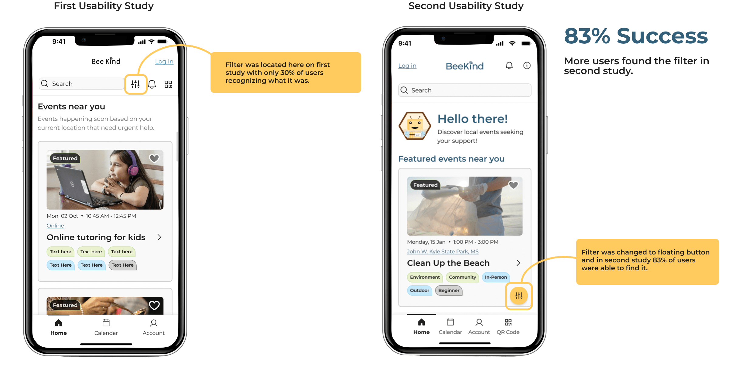
In the first study, only 30% users used the filter for finding events, suggesting it was not easy to find or understand. We marked this as a high-priority (P1) issue with significant impact but low effort to fix. Our adjustments led to an improvement of 83% of users finding the filter successfully.
Signing Up for Events
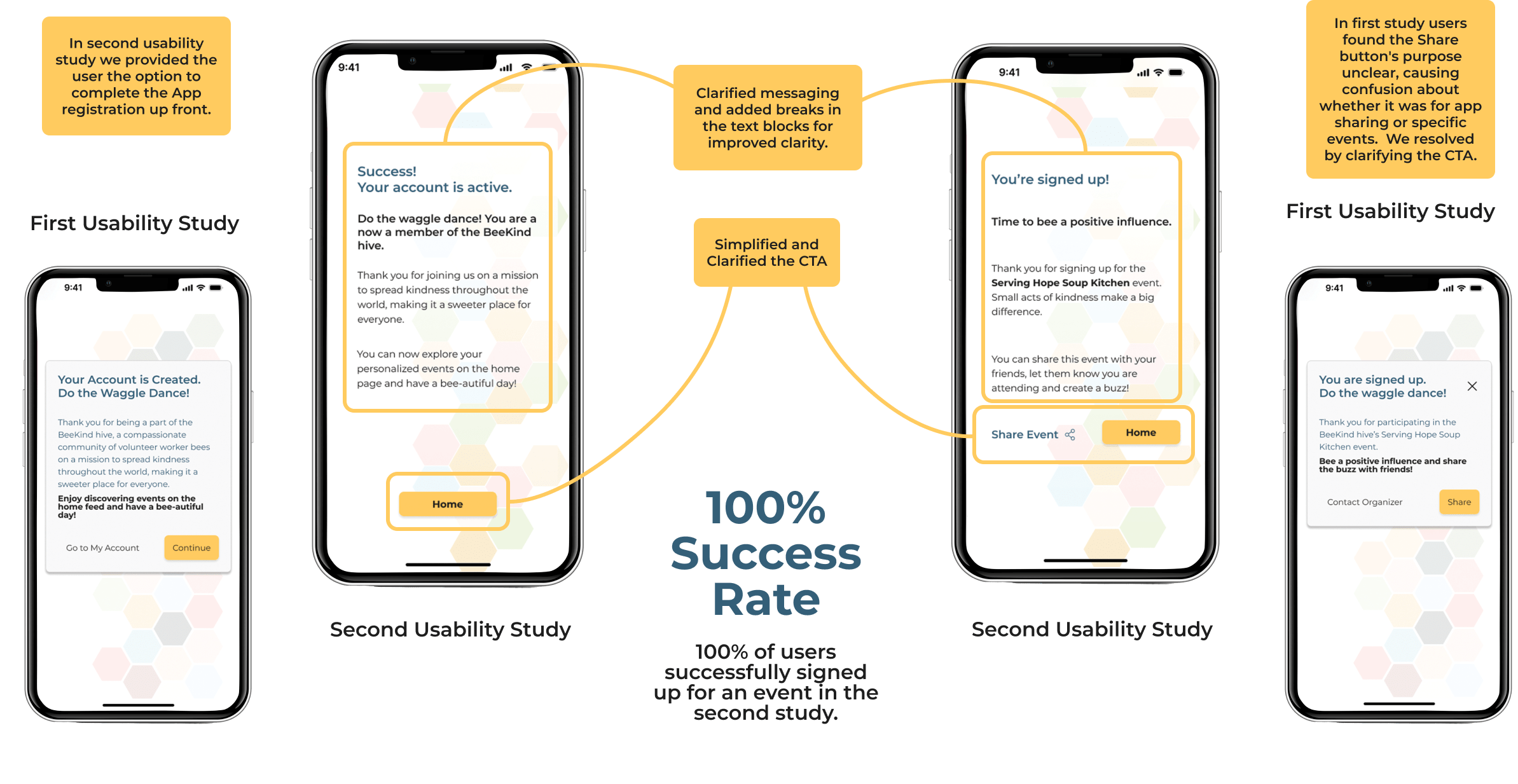
In the first usability study, users found the sign-up process too long. The initial prototype had a single path, requiring users to register and sign up for an event together, contributing to the perceived lengthiness. In the second prototype, I added an alternative path, allowing users to pre-register for the account, significantly reducing the time to sign up for events and increasing satisfaction.
Additionally, in the first study some users were unsure if they successfully signed up. I resolved this by refining content and providing clearer messaging during account creation and sign-up.
Logging Hours At Events
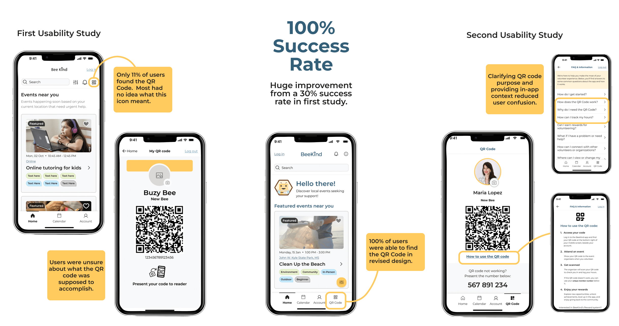
In the first study only 30% of users found the QR code and logged their hours. I marked this as a high-priority (P1) issue with significant impact and requiring a high effort to fix. The adjustments made onto the second prototype led to an improvement of 100% of users finding the QR Code successfully.
Understanding Rewards
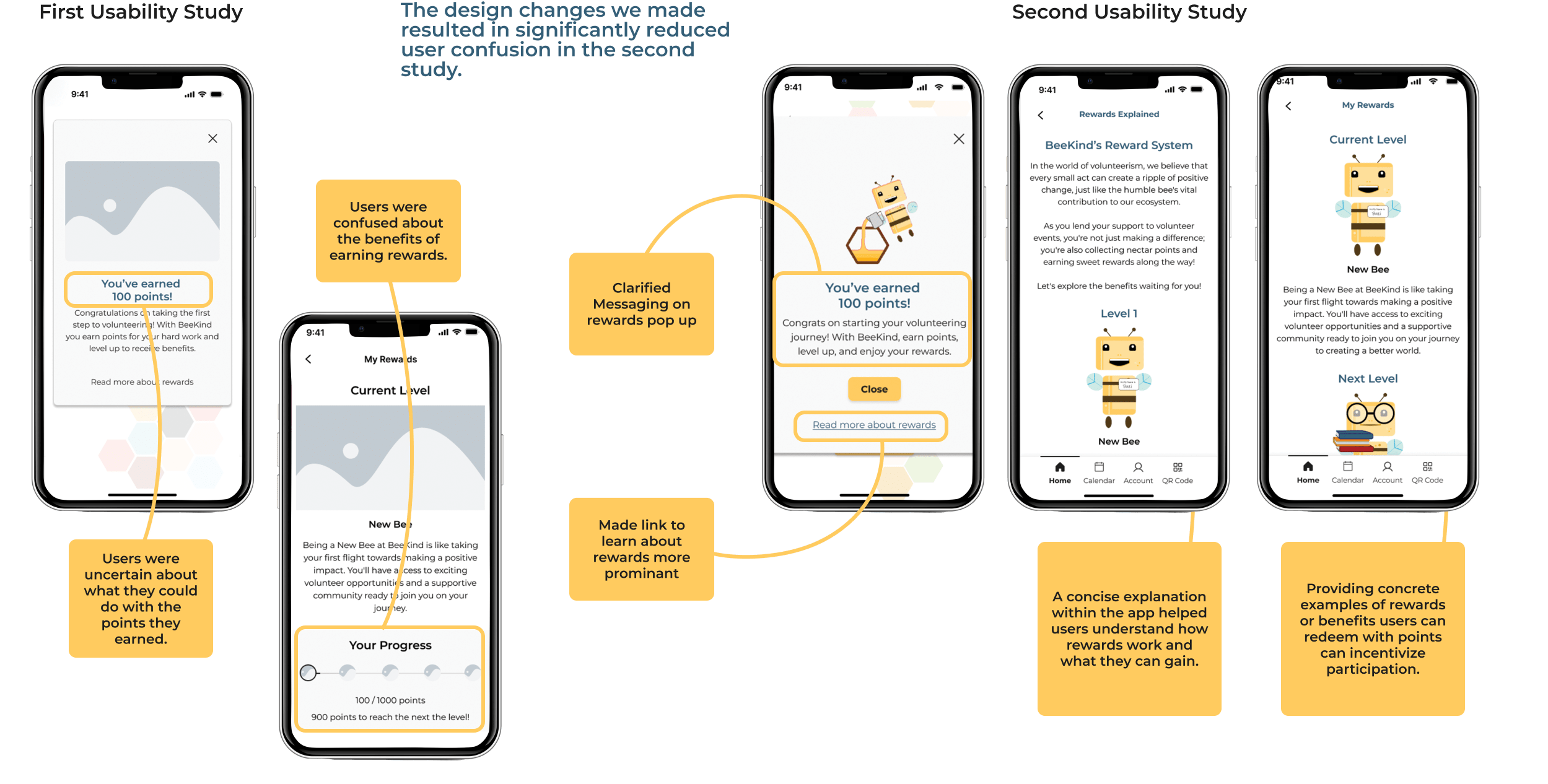
Feedback from users in the initial study highlighted the need to improve the explanation of the rewards system, specifically by outlining how points are used and clarifying incentives for rewards. As a response, I had the team conduct a second user survey to identify the best ways to address these concerns and then implemented that along with more detailed explanation pages into our hi-fi designs
Calendar Functionality
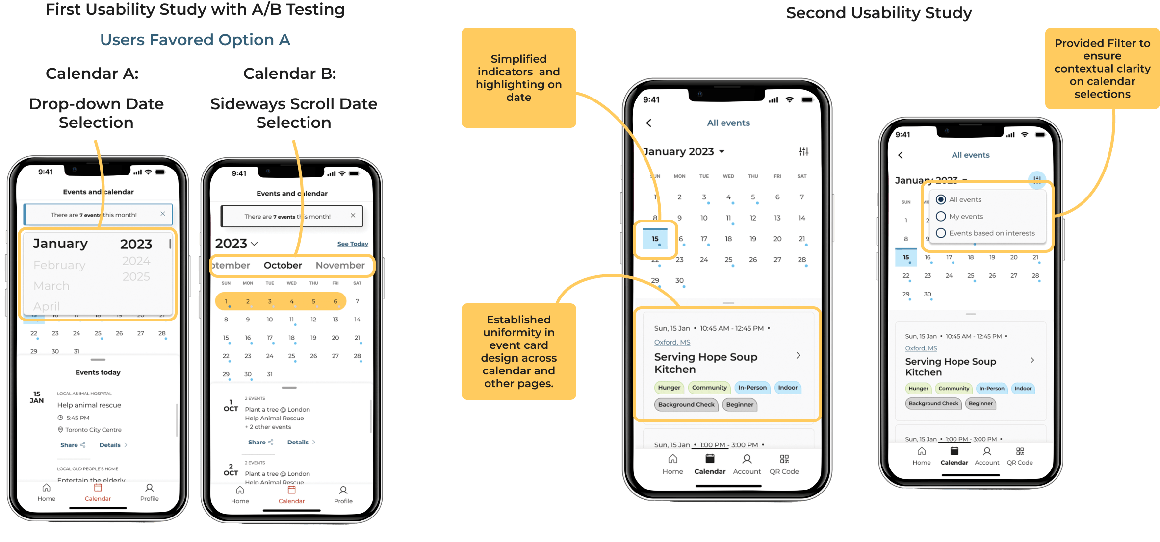
In the initial usability study, we conducted an A/B test to determine the preferred method for calendar date selection. Users favored a dropdown menu for month selection. Additionally, feedback highlighted challenges in indicator clarity, with users expressing difficulty in identifying highlighted dates with events. Consistency in event card presentation on the calendar view was emphasized, along with the expectation of seeing equivalent event details when clicking on a date. Users also voiced uncertainty about whether the displayed calendar was personal or all-encompassing, emphasizing the need for contextual clarity to mitigate confusion.
Editing Profile
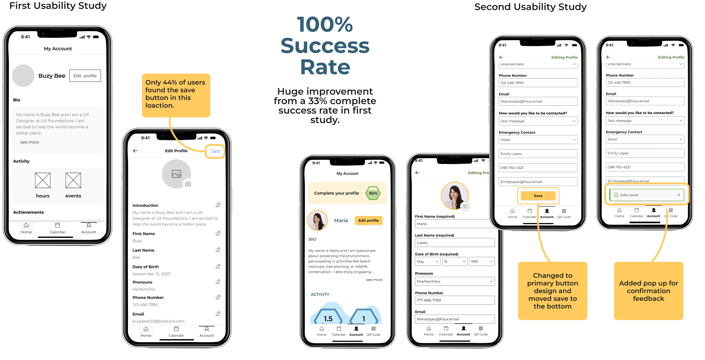
A significant 60% of users encountered challenges locating the save button, resulting in an inability to save profile changes in our first study. Additionally, users expressed a desire for confirmation feedback upon saving to ensure the successful execution of the action.
Additional Findings
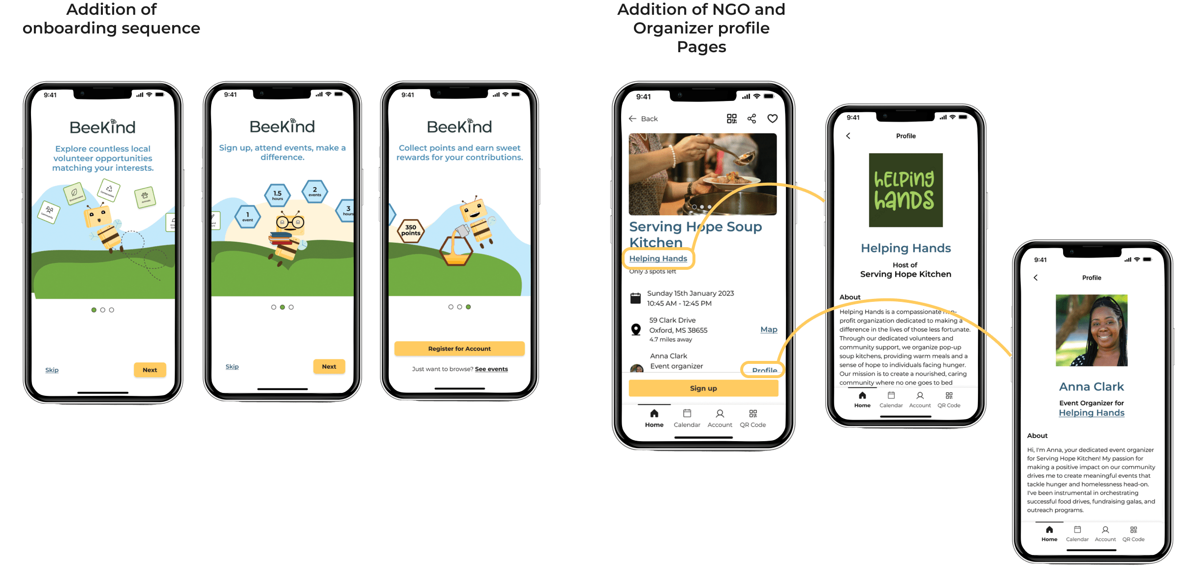
In the feedback from the first usability study, users showed a preference for an onboarding process with more information. Additionally, users expressed a need for enhanced information transparency concerning NGOs and event organizers, emphasizing the importance of providing names and contacts. The team and I worked on new screens to fulfill this request, helping to build trust and credibility in the platform.
What's Next For BeeKind?
During the ideation meetings I conducted with my team I gathered ideas for all potential features. However, facing constraints on what could be implemented in time, I employed the MoSCoW Matrix for prioritization, leading some features to be put into a backlog for future iterations. Moving forward, the key initiative involves assessing the necessity and value of incorporating these features, ensuring alignment with user needs and preferences.
In-App Messaging: I recognized the significance of In-App Messaging as a pivotal feature to enhance the overall user experience within the application. This functionality would enable NGO organizers to directly communicate with volunteers regarding event updates and information, promoting streamlined and centralized communication within the system, as opposed to relying on external email channels.
Friends and Online Networking: A substantial portion of the research conducted indicated that the primary motivators for consistent volunteer participation are friendships and social interactions. Furthermore, the supplementary investigation into reward systems highlighted the significant value volunteers place on the acknowledgment and visibility of their accomplishments, often finding this recognition as rewarding, if not more so, than tangible items.
Feedback System for Reviews: Usability study findings indicated a user preference for the inclusion of a review feature, allowing for both contribution and access to others reviews related to events and organizations. Introducing this feedback capability has the potential not only to enrich user experience but also to serve as a motivational factor for volunteers contemplating participation in events where uncertainty about enjoyment exists
Final Thoughts
I’ve effectively mastered the skills needed to assemble, manage, and orchestrate a unified, cross-functional team spread across different time zones. The collaboration I cultivated between myself and the team led to the successful development of an MVP app design that tackled the market challenges that I identified. Beyond resolving the main issue, I also uncovered additional avenues for the app’s growth and expansion, paving the way for a promising future. This achievement marks a significant step towards establishing BeeKind as a user-centric platform fostering a unified volunteering community, bridging the gap between volunteers and non-profit service managers and addressing the crucial issue of awareness about available opportunities.
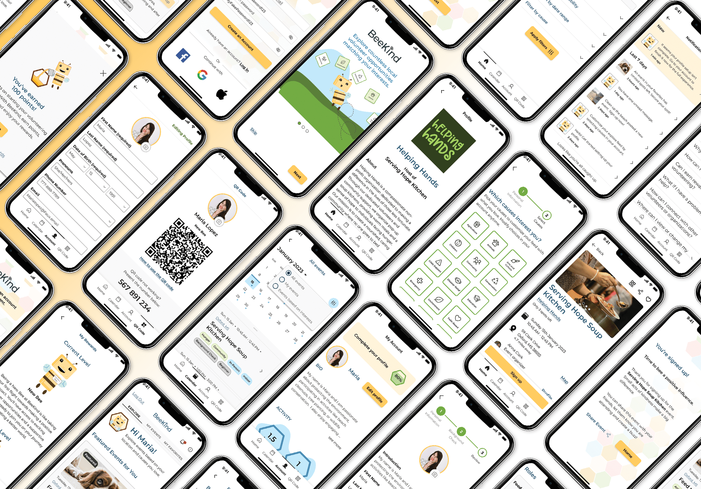
Still want to see more? Check out research, ideation, and other deliverables from this project.
See Other UI/UX projects
Want to work together?
I'm currently available for freelance work.
Explore my services page for more info and contact me today for 15 min free consultation to begin discussing your project.

A multidisciplinary designer with two decades of product design experience, ready to assist you in creating meaningful connections with your customers.
Contact
Connect
© copyright Denese Vicky Manley 2025
Site Designed and Developed by Denese
